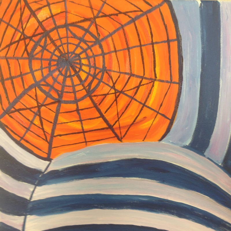
I created this piece with oil paints mainly a Prussian blue and orange color scheme. These colors were chosen to create a more artsy and abstract look to the Guggenheim because it is an art museum. I learned how to better blend colors in this piece. Although, I may have over blended. Therefore, I plan to go back and touch up some of the shadows and highlights, to create a more rounded and 3D look. I think one of the few things I really like in this piece is the contrast of colors because it creates visual interest. In addition, I really like the composition because it goes with the golden ratio. This is an in progress and I will go back and touch up parts to better this piece.
0 Comments
The above picture is an in progress picture because I am taking a short brake from this piece to gain a different perspective and improve it. At first I thought this would be a simpler piece, I was very very wrong. Straight, thin, and shaded lines are harder to capture that I thought especially with oil paints. Due to the drying process required with oils I will be returning slowly but surely to finish. I do think the archways are well shaded and set the perspective. The new technique I tried for the clouds and sky definitely improved from my last piece. I have found my best friend when painting skies is cerulean blue it created a certain depth in the sky. As well as making the clouds float and light in the sky. Composition in this piece makes a huge difference I think the off centering made this a stronger and more artistic piece. This showed my style and flows with my other concentration pieces. I am proud with how this piece is coming along and I am sure I will like it even more once it's done.
I was very very very very scared to try and tackle this complex and detailed bridge. At first I really didn't think I could do this but I gained some encouragement. I learned in this piece to take one line at a time which will definitely help me in future pieces that are even more detailed. This shows my perspective of architecture and how I see it as an artist. The composition I feel is string in this piece because it is almost framed by the front couple if bars which sets the perspective for the whole piece. I used a different type of brush than normal which helped me to keep the lines straight without a ruler. Highlights and shadows proved probably one of the most important parts of this painting. The reason being it set the perspective and created a 3D look to each little bar. I am very proud and happy with how this piece turned out, because I was worried at first to take such a risk. I definitely conquered this challenge and there for it is my favorite concentration piece so far.
I began by doing some very precise sketching with a ruler of the monument because I wanted to be sure to get the right angle and proportion. Then I painted a blue wash over my precise sketching. Next I painted the blue sky back ground which was harder than I tough because it was difficult to get the right blue. I eventually decide to just go with it and mix the colors in the canvas until it looked like a sky and light and airy. Then I went on to paint the clouds mostly with my fingers until I figured out how toxic oil paint is so I decided to use gloves. But using my fingers as a painting tool definitely made a difference in the texture of the clouds and the wispiness. I finally moved to the monument it self and used lots of different colors to create a light skin type of color. Finally I painted the trees in front of the monument in the foreground to give the painting a bit of depth. This was probably on of the favorite parts because I got to change the texture from a smooth type painting and make it more rough by giving the trees their leaves. I really enjoyed painting this and I think I learned more about background middle ground and foreground through this piece. As well as how create more depth in my pieces in the future.
This is one of my favorite pieces I have created yet this school year. It really shows my growth as an artist and the tie between architecture and painting. Which are two of my favorite things and very important parts of my life. When I started this painting I was very very timid about the whole thing because it is a lot going on a very detailed bridge, a lake, trees, bushes, and a railing. I was worried it might draw away attention from the architectural focus the bridge. As I painted this piece I found the surroundings of the bridge not only didn't distract from the bridge but rather enhanced it and that the environment architecture is in is almost as important as the architecture itself. This bridge flows well with the environment and I feel I capture that in this piece. As well as creating depth and yet keeping the bridge very detailed and the focus. I absolutely loved painting this piece and was very happy with my process as well as the out come.
I began this piece by doing a blue wash and sketching out the paddle board and the buoy. Next, I began painting the lake and blending many different blues and hues of blue. Then, I painted the trees and reflections of those in the lake. The paddle board was my next step which was hard because I had to be careful to not let the blue and orange mix. Then to tackle the buoy, I was nervous about how the reflection of the buoy in the lake because I felt it would be difficult at first. Once I started and got into it and painted the buoy I took a couple risk to see if it would work and looked how I wanted. The reflection was definitely the hardest part of this piece but it also really created movement in the whole piece. I really really like this piece and I feel it was very successful, because the colors of the lake blended well. As well as the contrast of the orange paddle board and the blue lake which really made the stand out and look vibrant. Finally, I improved in this piece at using color and the difference that can make to my art and putting emphasis on certain pieces.
This piece is he 3rd in a 3 part series of my pet portraits. I began this series over a year ago and was happy to finish it off with my cat Sally. I painted the back ground and aides with acrylic to match the others in the series. Then I began painting the cat which I have definitely struggled with in the past. I found a way to draw her and capture the texture of the fur but had yet to capture this with paint. So with my new found love for oils I took a shot. I am very happy with the out come, because not only did I capture the texture of the fur but a bit of personality as well. Personality is hard to capture in a painting but I feel I definitely accomplished this with my use to color and how I brought her eyes to life. There for I feel this was a very successful piece and I grew a lot as an artist through this piece.
I created this piece with oil paints on a canvas. At first, I was very intimidated by this painting because I have never painted a face before and let alone with oils. In the process it was very difficult to keep going and painting because I kept thinking it didn't look like me. Then I looked at my paining and my face in the mirror together and that's when I think this painting really turned around for the better. My favorite part of this painting is the contrast of black and white and the color tribal type print on my face. This really shows my personality through art, the black and white may look serious but the color just shows how my personality always shows on my face. This piece is really where I found myself as an artist and I am so so happy with the out come because it looks like me and it shows personality which is what I strive to do through art.
I created this partly mechanical turtle with prisma colors and the blending tool. I started with completely grass and realized that it would not be mechanical so I subtlety put metal pieces of grass in. I wanted to make the mechanical side look natural but it became very obvious when I put in the metal plate. I definitely improved a little in this project and learned more about how to create different textures with prisma colors. If I did this project again I would change a lot of things to improve it. Like making a smaller space and more detail in the grass and plan out the composition better.
For this painting I used oil paints to paint an unusually interior of caprese salad. At firsts I kind of hated this painting because it looked like a cake and I learned that my colors were too deep and I needed a more translucent look to make it tomato like. I learned a lot more about oils and different techniques with this take two of oil paints. Still trying to get used to this material after so many years of acrylic. But I like how this turned out because I feel the colors contrast well and I learned a lot from this painting. Another little step I took was to not be afraid of highlights. I used plain white without dulling it! At first this kind of scared me but I think it really improved my painting. This proves that as an artist you have to take risk to improve which I feel I did.
|
|